Please read prior post below to have this make sense.
The case study by ENLASO "Creating a New Language for Nutrition: Mc Donald's Universal Icons for 109 Countries" is really worth reading. As the topic of obesity and packaged foods hit media spotlights many companies started searching for a better way to inform (or you can say disclose) the nutriional content of there products. What I assumed would be primarily an American push, the real guidelines that Mc Donald's based their communications of nutritional information on were set down in Europe by the EU. When trying to work with visuals for each country McDonald's decided a global solution would be better. These are the main questions they had to first ask:
"1. What visuals can communicate the desired nutrients?
2. Does the visual work in 109 countries without evoking negative or socially/politically inappropriate connotations?
3. Will the visual print or display well in all media, including packaging?
4. Does anyone else already own rights to the image that might prevent it from being used in this context?"
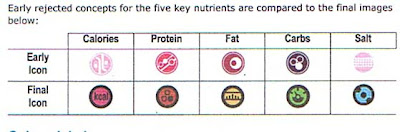
Next they set about researching it. This is where some of the nutrition icons that seemed well designed, in my mind, did not communicate the same way to people in other regions. Here are some of the responses to proposed Calcium icons from different countries.
BONE- "When Commonly associated with dogs, dog food and low quality. Has potentially insulting connotations in some Muslim regions."
MILK CARTON- "Perceived with only vague resemblance to milk cartons in some countries. More countries associated image with buildings, and in some cases portable toilets. Two countries noted resemblance to phallic symbols or tombstones."
MILK BOTTLES- "Milk bottles were often associated with mysterious, dark liquid, beer or wine bottles. Some isolated feedback that bottles could contain poison."
SMILE- "Although the “smiley face” was considered a positive image, typically it was not associated with calcium. In Ireland this symbol is associated with narcotics or medicine."
The visual review criteria was as follows:
"• Existing meanings for the visual
• Prevalence of the existing meaning(s)
• Existence, prevalence, intensity of negative connotations
• Existence, prevalence, intensity of positive connotations
• Existing similar symbols currently in use
• Interpretation issues caused by color variations
• Risk assessment of misinterpretation of the visual
• Overall acceptability of using a visual, based on expert iconographer judgment"
Once the icons were agreed on by finding the positive feedback of majority they worked on application to packaging. Some of the finer elements on the icons had to be elliminated becasue of size constraints. To me, this really hindered some of the icons like fat which now looks like a bar graph more than a ruler as intended.
Now what makes this whole thing really interesting is this. The fact that I can read the case study as it is avaiable to the public. Another thing that McDonald's made public is thier icons! The public is allowed and I imagine encouraged to use them in the food and restaurant industry. they truelly are trying to make these icons the global icon for nutrition. This is so smart.
Now will other companies want to use icons developed by Mc Donald's?