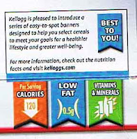


As companies start to create their own solutions to communicating nutritional information I cannot help but compare them to the McDonald's icons below. One major campaign for nutrition icons and labels are General Mills and Kelloggs as they dish out their "Goodness Corner". Their website describes it as this:
"General Mills is proud of its “Goodness Corner™” innovation. The Goodness Corner provides a clear, icon-based information system to help consumers quickly understand the nutrition or content benefits of products. This system is based on criteria established by the U.S. Food and Drug Administration for labeling regulation and potential claims.
They seem to have been a bit premature in this task as they now have three different versions of these icons or labels in circulating, the top one I think is the final or just is the most out right now. Also their website has a full list of icons but I only viewed them on a select number of cereal boxes in the format of the right-hand image.
View the full list at:
http://www.generalmills.com/corporate/health_wellness/your_health_detail.aspx CatID=7780&SelectCatID=7780§ion=yourhealth
Anyone else have any feelings about these or other nutrition icons?
2 comments:
I couldn't get to the site, but I've read the other posts. It's interesting McDonald's is taking this initiative, but I think other company's definitely want "in" and make their own. Unless someone like the FDA puts a universal system out or something. I see all these pretty new colors on my cereal but... I guess their point is "make it easy for them" which, where I work, is like some sort of mantra. The second picture's icons doesn't mean much to me. Guess they're gonna have to think this one through a little harder.
I agree, I will be very suprised if someone does pick up McDonald's icons. The association may be too much. It is funny to watch this nutrition scramble though!
Post a Comment