Saturday, June 7, 2008

Hiking "Naked Ground" in Slickrock Wilderness


Such a lucky day! This is the view from the top of the trail where naked ground merges with many other trails that meander throughout Slickrock Wilderness. This was my fouth time up there and I have never seen it so clear!

Two things of interest happened:

1. Some of the signs have been removed from the Naked Ground trail when entering from Joyce Kilmer Forest. This had me confused for a bit and if you have never been on the trail it would not be easy to find now.

2.I saw a man that looked lost, off the trail, holding a GPS. Upon asking if he was lost, he said that "No. He was just doing Geo-Caching". He explained to me further that there is a website (www.geocaching.com) that has a list of GPS coordinates that people have hidden stuff in and you can just type in a zipcode grab your GPS and find it. The hiker said he likes the treasure hunt aspect of it and I think it is well worth trying at least to make you daily routine and walks seem more interesting. I live in a small city (I can walk it in a an hour) and there is plenty of people who already have hidden stuff just in my area, so this should be fun.

Monday, May 12, 2008

Taking A Break

I will not be blogging for awhile. I am making working double to make up for lost times and am going up to the mountains this weekend to say hello to my mom for Mother's Day. I am still going to post at both blogs so check in if your so inclined.

As far as the trail I will be hiking and do recommend starts in the Joyce Kilmer Memorial Forest, Slickrock Wilderness in North Carolina, and is called Naked Ground it is a day hike or you can camp at the top and hike the other25miles? of trails that conect to it. That trail is about 9-10 miles 4.5 climb up and the rest is ridge down. A great way to begin summer!

Thursday, April 24, 2008

Portfolio

I am going to try to post some of my work onto a new blog. Since emailing PDFs in the past have given me trouble I am going to try just sending a link to people.

Most of my works are on slides and I was bad at documentation over the years, too broke for a digital camera during that time. So much of what I have done has been given away or taken apart with out any documentation, I am still kicking myself for this, but I will try this summer to round up some work. And when I do I will post them here:

http://chantelleportfolio.blogspot.com/

Check it out if anyone gets a chance.

Tuesday, April 22, 2008

Tim Hawkinson- Just To Keep Things Interesting


This is a fine artist whose work I really enjoy. His processes are inventive, as much of his work involves some science and new technology fundamentals, and his work is often based around his own body. He is a great one to look at for inspiration.

Thursday, April 10, 2008

Chip Kidd and This American Life

Two things worth knowing about are happening soon.

1.Chip Kidd is coming to SCAD-Atlanta on April 17 to discuss his new book at a writer series. It is FREE.
2. This American Life will be broadcast live on satellite to movie theatres around the nation on May 1st. Many places in Atlanta included.

Tuesday, April 1, 2008

Creative block? Take a look at your Mac! or Loaded Logos

I am well past satiated on Apple news, as I am sure so is everyone else, but one more cannot hurt!

From Duke University at: http://www.fuqua.duke.edu/news/thinkdifferent-0308.html

Apple Really Does Make You "Think Different"

March 18 , 2008 | DURHAM, N.C. –- Whether you are a Mac person or a PC person, even the briefest exposure to the Apple logo may make you behave more creatively, according to recent research from Duke University’s Fuqua School of Business and the University of Waterloo, Canada.

In work to be published in the April issue of the Journal of Consumer Research, Professors Gavan Fitzsimons and Tanya Chartrand of Duke, and GrĂ¡inne Fitzsimons of Waterloo, found that even the briefest exposure to well-known brands can cause people to behave in ways that mirror those brands’ traits.

“Each of us is exposed to thousands of brand images every day, most of which are not related to paid advertising,” said Gavan Fitzsimons. “We assume that incidental brand exposures do not affect us, but our work demonstrates that even fleeting glimpses of logos can affect us quite dramatically.”

Go to the site to continue this article.

Tuesday, March 25, 2008

Currently

My thoughts on my Flash movie are that I imagine quite sometime from now that when I look back I will laugh at my naive methods of construction...... because if what I am doing right now is correct then this is just wrong.

Monday, March 24, 2008

Japan's Melody Highways


Another reason why we should look to Japan for innovations. Road signs, ticketing, speed bumps to control speed? Try music. In Japan they have created test roads with grooves that as you drive over it it will create a popular tune. You have to drive at the right speed to make the melody sound correct. The driver will be rewarded for driving correctly plus living near traffic must be more pleasant.

Check it out at:
http://www.youtube.com/watch?v=PHhGzfsqKH0

Friday, March 14, 2008

Timeless Design Needs Improvement

It is hard to think about items that have been around for decades as still needing design improvments, at least standard design features. There are three major design changes that I would love to see as a standard. Alarm clocks that have the time & am/pm and volume setting as a visual on the display face. I have such a problem setting my alarm. I always set it for night instead of day and my boyfriend will turn my volume down on the weekends so come monday I cannot hear it. I have four alarms so I believe that this is pretty common among various inexpensive table alarm clocks. The other is the "on" signal for stove/ovens. My oven has no signal that the burner is on, none beides the smell of natural gas. Most just have a small red light. This design flaw has caused one fire in my house when I was young and a number of potential fires over my lifetime. The sad thing is that this lack of design has caused a mass paranoia all across America as people think "did I turn the oven off",myself included. The final major design change I would love to see, and this will take awhile, is the evolution/transition of the pinky. This what I would love to see our hands look like...


Wednesday, February 27, 2008

You are a snob!... or just have low modesty.

Mindset Media released a report profiling the personality of the average Mac user. Here are the reported traits: high-openness, low-dogmatism, low-modesty, high-superiority, and high-perfectionism. Of course some are reporting the Mac users as having super egos and others are seeing the Mac user as a brighter future. No mystery as to which side the marketing department will take. My thought is that creative people are needing more expensive and more technology, so they are becoming recognized in the market place as a viable market. Now their personality has found a home in a technology and visa-versa. I cannot find the full report but here is a link to its mention:
http://www.prnewswire.com/cgi-bin/stories.pl?ACCT=104&STORY=/www/story/01-16-2008/0004737667

Sunday, February 17, 2008

This is this american life


I am addicted to "This American Life" radio show. It is my "Lost"," American Idol", or "24". Not having any real knowledge of their tv show I decided to view their promo and this image was used as the title screen. Without the words I know it is not obvious as to the meaning, but with the words and knowing the feel of the show it feels so right. Or maybe this is just a shameless plug for my favorite show.

Go Here to Listen:

http://www.thislife.org/Default.aspx

Wednesday, February 13, 2008

Apple TV


I just viewed the intro video to Apple TV. This product is a great step in the right direction yet I am not seeing, besides the rental feature, how this product with a $300 price tag is better than just getting a macmini at $550 and having a great deal of other features plus the use of it as a computer and music system. Also the price of 2.99- 3.99 a move for a 24hr period is a bit much. The prices on movies and other products need to come down, the cost that have been elliminated in production of these products have been greatly reduced and I do not think it is being reflected well in the price. That said, I am excited about on demand movies with out being tied to a subscription.

Has anyone had the opportunity to use the AppleTV?

Monday, February 11, 2008

Trail Signs

I have a book called "Signs and Signals" by Catherine Davidson. This is a book outlining some basic forms of communications using signs and signals, obviously, like sports hand signals or sign language. One section that I thought would shed some light on signs along the trail ended up confusing me more.


As a brief intro stated, some of these signs might be made out of objects found along the trail. Interesting to think of how to display a message using found objects and how they really work only with found objects. As 2-D symbols representing how they would be seen along the trail the signs, three out of four, seem misleading especially because the arrow (the main clue) would not be there. If I was on a trail and said "look a trail signal" and saw the found objects arranged so I would probably get it, mostly because it is one of a handful of messages that would want to be communicated. Now how to recognize when there is a sign versus nature's own fate or displaying a more complex message like "rattlesnake wielding mountain men below" I have no idea.

Tuesday, February 5, 2008

Post Secret Book


I was in the book store the other day and ran across the book My Secret: A Post Secret Book which Amazon describes as this:

At the beginning of 2005, Frank Warren launched a new blog called PostSecret as an experiment in community art, inviting strangers to mail him anonymous postcards that made art out of their innermost secrets and then posting a selection of the cards every week on his blog. Within a year, his blog was one of the five most popular in the world, and his first book, PostSecret, was one of the surprise bestsellers of 2005. My Secret is his second book, a collection of cards from teens and college students--none of which has been shown on the website--that carries the same emotional power and creativity that have made Warren's project a phenomenon.


Most of the secrets were a bit juvenile but one almost brought me to tears. A person sent in a postcard that his Grandmother sent to him. She would send him postage paid postcards so that he would write to her. Now the grandmother had past but the grandson still had empty postcards one of which he sent to this blog, now book, reflecting on how he should have written her more.

This hit home since it took me awhile to realize my Grandmother likes me to send letters and that at 92 that is all she really wants is to hear from family and be reminded of how amazing of a woman she has been in her life.

Monday, February 4, 2008

Knowing When it is Time to Change


My family keeps twisting my arm to get a new TV. They have all bought new TVs in the past two years so I imagine they still have the fever. I really do not see a point until 2009 when the signal goes digital, even then I might just take the rebate and get a box. So I have resisted for the past years explaining a new TV is a luxury not a necessity.

This works for the most part, then as I was driving I had to chuckle when I realized that I was behind the icons. The icon for the TV has changed. My rabbit ears gone from the picture. It was like watching the changing telephone icons, only to go over to my grandmothers and realizing she missed decades of design changes.

So this has me thinking about icon evolutions. Already the light bulb is changing, but what else?

Saturday, January 26, 2008

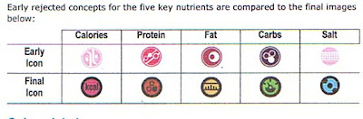
Comparing Nutrition Icons


As companies start to create their own solutions to communicating nutritional information I cannot help but compare them to the McDonald's icons below. One major campaign for nutrition icons and labels are General Mills and Kelloggs as they dish out their "Goodness Corner". Their website describes it as this:

"General Mills is proud of its “Goodness Corner™” innovation. The Goodness Corner provides a clear, icon-based information system to help consumers quickly understand the nutrition or content benefits of products. This system is based on criteria established by the U.S. Food and Drug Administration for labeling regulation and potential claims.

They seem to have been a bit premature in this task as they now have three different versions of these icons or labels in circulating, the top one I think is the final or just is the most out right now. Also their website has a full list of icons but I only viewed them on a select number of cereal boxes in the format of the right-hand image.

View the full list at:
http://www.generalmills.com/corporate/health_wellness/your_health_detail.aspx CatID=7780&SelectCatID=7780§ion=yourhealth

Anyone else have any feelings about these or other nutrition icons?

Mcdonald's Nutrition Icons- Updated


Please read prior post below to have this make sense.

The case study by ENLASO "Creating a New Language for Nutrition: Mc Donald's Universal Icons for 109 Countries" is really worth reading. As the topic of obesity and packaged foods hit media spotlights many companies started searching for a better way to inform (or you can say disclose) the nutriional content of there products. What I assumed would be primarily an American push, the real guidelines that Mc Donald's based their communications of nutritional information on were set down in Europe by the EU. When trying to work with visuals for each country McDonald's decided a global solution would be better. These are the main questions they had to first ask:

"1. What visuals can communicate the desired nutrients?
2. Does the visual work in 109 countries without evoking negative or socially/politically inappropriate connotations?
3. Will the visual print or display well in all media, including packaging?
4. Does anyone else already own rights to the image that might prevent it from being used in this context?"

Next they set about researching it. This is where some of the nutrition icons that seemed well designed, in my mind, did not communicate the same way to people in other regions. Here are some of the responses to proposed Calcium icons from different countries.


BONE- "When Commonly associated with dogs, dog food and low quality. Has potentially insulting connotations in some Muslim regions."
MILK CARTON- "Perceived with only vague resemblance to milk cartons in some countries. More countries associated image with buildings, and in some cases portable toilets. Two countries noted resemblance to phallic symbols or tombstones."
MILK BOTTLES- "Milk bottles were often associated with mysterious, dark liquid, beer or wine bottles. Some isolated feedback that bottles could contain poison."
SMILE- "Although the “smiley face” was considered a positive image, typically it was not associated with calcium. In Ireland this symbol is associated with narcotics or medicine."

The visual review criteria was as follows:

"• Existing meanings for the visual
• Prevalence of the existing meaning(s)
• Existence, prevalence, intensity of negative connotations
• Existence, prevalence, intensity of positive connotations
• Existing similar symbols currently in use
• Interpretation issues caused by color variations
• Risk assessment of misinterpretation of the visual
• Overall acceptability of using a visual, based on expert iconographer judgment"

Once the icons were agreed on by finding the positive feedback of majority they worked on application to packaging. Some of the finer elements on the icons had to be elliminated becasue of size constraints. To me, this really hindered some of the icons like fat which now looks like a bar graph more than a ruler as intended.

Now what makes this whole thing really interesting is this. The fact that I can read the case study as it is avaiable to the public. Another thing that McDonald's made public is thier icons! The public is allowed and I imagine encouraged to use them in the food and restaurant industry. they truelly are trying to make these icons the global icon for nutrition. This is so smart.

Now will other companies want to use icons developed by Mc Donald's?

Tuesday, January 22, 2008

McDonald's Icons


I have not been to a McDonald's in years, so this is probably old news to some. McDonald's introduced nutrition icons back in 2005 (approx) to place on their packaging. They faced the challenge of being a global company and needing a consistant design. Here is a link to the case study discussing the objectives and development process of these icons . I will finish the article before I say anymore about this. Enjoy!

I have only been able to find this case study at this one source. It is a blog so scroll down and you will see the post with a pdflink there.

http://images.google.com/imgres?imgurl=http://people.w3.org/rishida/blog/images/nutrition-icons.gif&imgrefurl=http://rishida.net/blog/%3Fcat%3D3&h=35&w=188&sz=4&hl=en&start=16&um=1&tbnid=mFTXCyp-JBFAMM:&tbnh=19&tbnw=102&prev=/images%3Fq%3Dmcdonalds%2Bnutrition%2Bicons%26svnum%3D10%26um%3D1%26hl%3Den%26client%3Dsafari%26rls%3Den%26sa%3DN

Sunday, January 20, 2008

Inkjet Meals


I heard about this chef named Homaro Cantu Jr. who uses lasers, liquid nitrogen ,and other unique processes for his culinary preparations. The one that intriqued me most was his using of a laser inkjet printer to print his menus, only his menu was edible rice paper and the ink was soy sauce. This sounds so fun to experiment with and really makes me take a second look at my printer's capabilities. Check out his restaurant Moto and other food inventions at : http://www.motorestaurant.com/flash/moto_main.swf

Thursday, January 17, 2008

Fondness For Futura

When taking typography last semester I had such a fondness for the Futura font. I just now realized why.


The majority of Barbara Kruger's most known work is all in Futura. Further more, promptly after this discovery I read an article by Sarah Boxer at the New York Times website which said this :

"Then there's Futura Bold Italic, which the artist Barbara Kruger made famous with her starkly graphic works like "Untitled (I Shop Therefore I Am)." Since the 1970's it has been linked with Kruger's feminist, anti-consumerist message. No one quite wants to get rid of it, but there is an advisory out for users: Know where your fonts have been."

Makes me really realize I have so much more to learn to even understand and know the basics about different fonts.